Statistical Process Control
x-bar and R charts
x and R charts are the control charts used for continuous data, e.g., the weigth or lenght of a product, the time to produce an item or reply a phone call...
x charts
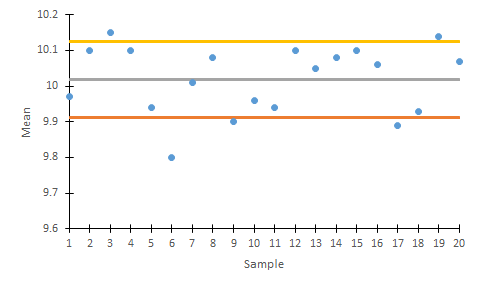
x charts show changes in the mean tendence of the process.
| Upper control limit (UCL) | Central line | Lower control limit (LCL) |
|
|
|
Where:
x̿ is the mean of the samples;
![]() is the standard deviation of the process (σ) divided by the square root of the elements per sample (n);
is the standard deviation of the process (σ) divided by the square root of the elements per sample (n);
and typical values for z are 2 (more restrictive) or 3 (less restrictive).

R charts
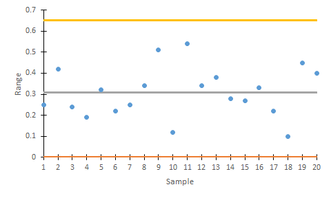
R charts show changes in the dispersion of the process.
| Upper control limit (UCL) | Central line | Lower control limit (LCL) |
|
|
|
Where:
R is the average range of the samples;
and D4 and D3 are taken from the 3-sigma table.

Building x and R charts
- Take 20-25 samples of 4-5 pieces/products each one. Calculate mean and range for each sample.
- Calculate global mean and range (
 and
and  ).
). - Fix desired limits (generally 3σ) and calculate actual control limits
- Draw samples in the chart.
- Analyze the results and research for the possible causes of variation
Complementary Excel files
Explanatory video
Licensed under the Creative Commons Attribution Non-commercial Share Alike License 3.0